LIFO
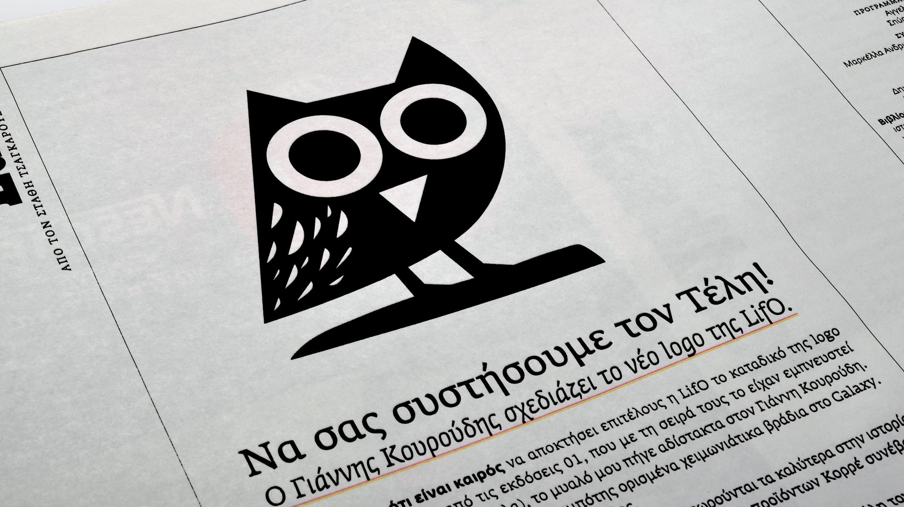
Yiannis Kouroudis, designs, the new logo of LiFO.
When I thought it was time for LiFO to finally get its very own logo (the snake was borrowed from the 01 publishing, which in turn was inspired by ancient hieroglyphic symbols), my mind went immediately to Yiannis Kouroudis. Not because he is a friend and a great companion to have drinks with on cold winter nights at the Galaxy bar. But simply because he is the best in his field.
His pictograms for the 2004 Athens Olympics are considered the best in the history of the institution (it is not an exaggeration) and the image of Korres natural products, contributed significantly to their global success.
But also in his body of work, Yiannis showed his great range: in the posters of the Greek National Opera he excelled himself and gave a new face to a dull, dusty Foundation, while in dozens of packaging designs and corporate identities he effortlessly tied grace with solidity. His work has the grace of a boxing magician – he floats like a butterfly and stings like a bee!
I asked him to draw an owl, an Athenian Owl specifically. Because we are the guide of the city of Athens and this is the bird of the guardian goddess of the city, Athena. It is also a bird that stays up all night, like all the self-respecting city journalists. And it stays awake. And it is funny. And it has charm. And despite his wisdom, it is still surprised and full of curiosity about everything that is happening.
He sented me 20 variations – one better than the other. To arrive at the one that from now on will accompany our print and digital editions.
When I asked him, later, what he wanted to accomplish with our logo design (which we immediately named Telis in the office – “he is nocturnal”, “he is a badass”etc.), he was clear and concise: To be as simple as possible, to “work” from a few millimeters to several meters, to be easily recognizable, to exude the values of LiFO and to be modern and timeless at the same time. I avoided fine lines and lean forms. My point of reference was the old sign of ΟΕΔΒ*. I hated it as a student and I love it as a graphic designer. It is the definition of simple and excellent design.
by Stathis Tsagarousianos, 10.9.2014
* The organization of publishing school books in Greece,
whose logo was printed on the back cover of all the school books.